Project Guidelines
Guidelines on selecting a data visualisation project
Here are some pointers for selecting the right data visualisation project.
Inspiration & Audience
This first part is the inspiration for YOU doing the project. Spending weeks on a project requires you to be really inspired by the topic. It is something you are willing to spend the time, beyond your day-to-day work. And hopefully, work on iterating on the output, even beyond the project time. It is a topic that you have been talking / thinking / planning about doing for a long-time and now is the right time to do it.
The second part is the audience or user for your project. Be clear in what you want your audience or user to achieve based on the project. The audience can be small & niche or large & personas. Think of writing a hook for your project and try to write it as: [Who is the Audience] - [What is the Change Outcome]. The possible action outcome for your project can be:
- Inform & Entertain: Make them understand the information in an interesting way
- Explain & Educate: Teach them a new insights or abilities about the topic
- Persuade & Recommend: Get them to act and behave in a different way
- Inspire & Motivate: Change their beliefs about the topic
Write a Title (one-line max.) and a Description (100 words max.) for your project - that can be used as an enthusiastic audience or user communication about this planned work.
Domain & Problem
Pick a domain where you have existing deep understanding of the issues, problems, challenges, and research in the area. These could be public policy, sports, finance, economics, culture, arts, business — areas where you are already knowledgeable and can have a deep, evidence-based discussion with anyone at anytime. It is extremely hard to build a good data-visual-story in a domain, where you don’t have deep-understanding or lived-experience about the context. In essence, you are asking the question whether you are the right person or team to be working on a data-visual-story in this domain.
The focus of the project is on using quantitative (measurable) data and visualising it to communicate. It is not on qualitative research or doing grounded-theory building about the problem (though they have an important place and are required in all client work). So you should already be aware of the research / issues in the domain and where you can access data about it.
The narrower the problem you want to address in your project, the better it is. From all the issues you have identified, pick a problem that is focussed, small and manageable.
Note: You can replace the word “problem” with “question” if that makes it easier for you to understand it.
Pick a domain and succinctly draw a mind-map of the main issues in it. Then pick one narrow well-defined problem from it as the focus.
Hypotheses & Data

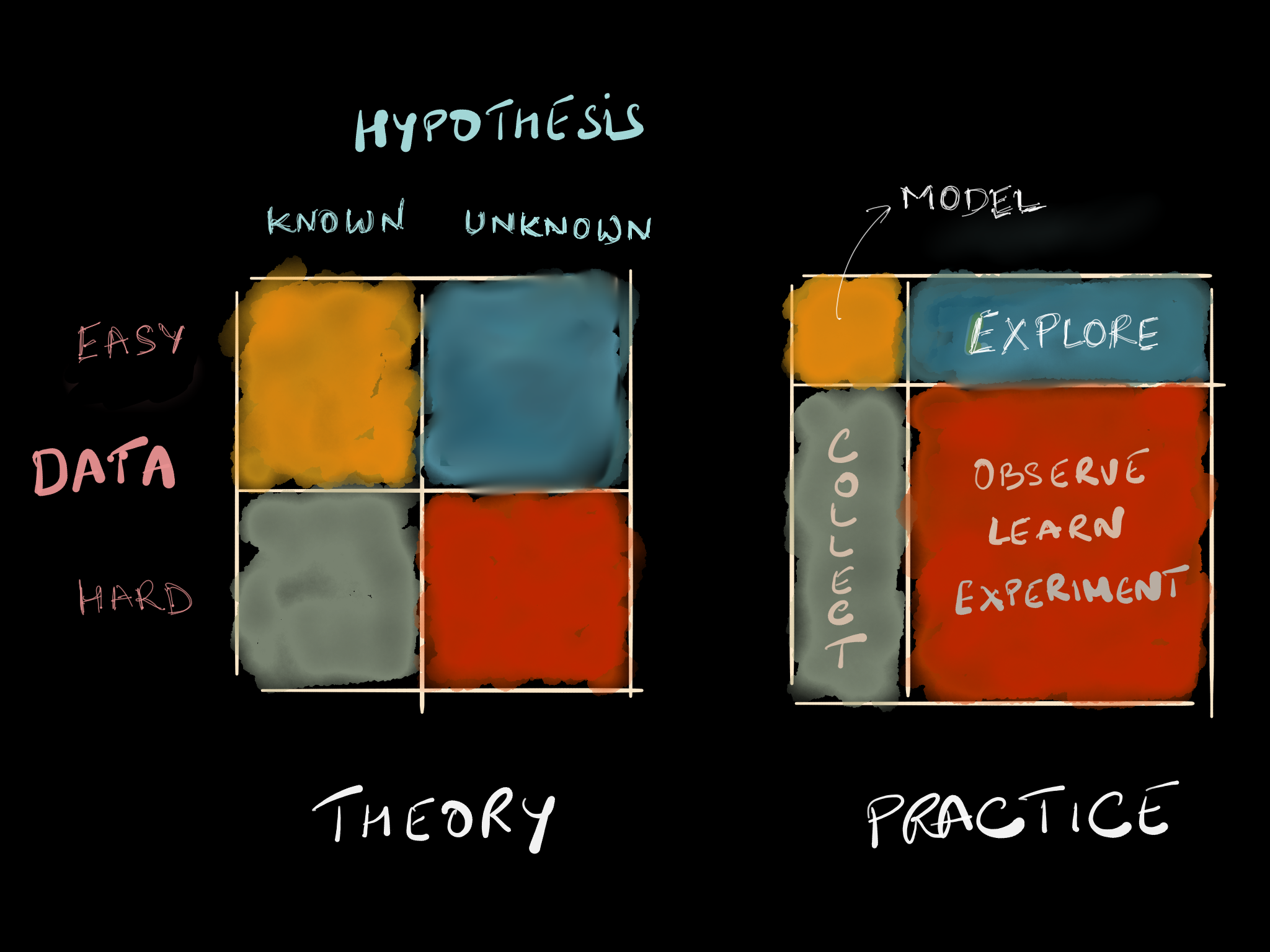
There are two-end of spectrum in data-driven projects.
- The problem is simple & well-defined, there are strong hypotheses about it, the data for it is easily available and you want to focus on using a data-driven lens to ideate & communicate it.
- The problem is wicked & amorphous, there are weak hypotheses about it, the data for it is hard to collect and you are looking to use a data-driven lens to first discover & define it.
As much as possible, choose a topic in the first category. For many of you, it may be the first time executing a data-intensive project, it is best to focus on well-defined problems.
More importantly, you need to ensure that the hypotheses can be confirmed or rejected with the required data for it. This is the hard part. In most cases, the data is available but not at the right granularity, or not available from secondary sources, or too hard to collect, and / or not possible to get. Often in those cases, you will need to either go back and change the problem or focus on a different issue for your project.
Note: You can replace the word “hypothesis” with “guess” if that makes it easier for you to understand it.
Create a structured diagram of the hypotheses you need to investigate for your problem and the data required to confirm / disapprove those hypotheses
Pudding.cool: Continue, Pivot or Put-it-down — An article detailing Pudding’s process to go from idea to their long-form interactive data story. Look out for how many “Put-it-down” are there in the process of creating data stories.
Medium & Context
Data visualisation can be created and embedded as part of multiple medium. Be clear on what is the medium you are targeting for your output. In general, custom static data visualisation are easier to create and build using graphical tools, than a custom interactive data visualisation, which will often require using coding based tools.
- Static: A poster, a slide deck, a video, or a static blog post.
- Interactive: An interactive web page, an application or a dashboard.
Also, define the context in which the audience or user will be accessing the work.
- Presentation: Audience will see the work in a one-to-many setting. Think a talk or a presentation you will be giving.
- Participatory: The user will be interacting with the work in your presence. Think small group interaction with audience.
- Personal: The audience or user will be interacting with the work on their own. Think a poster, a blog post, an interactive application or dashboard.
Define the context in which the audience will be using the work and your choice of output medium.